Admin User Interface
Pages
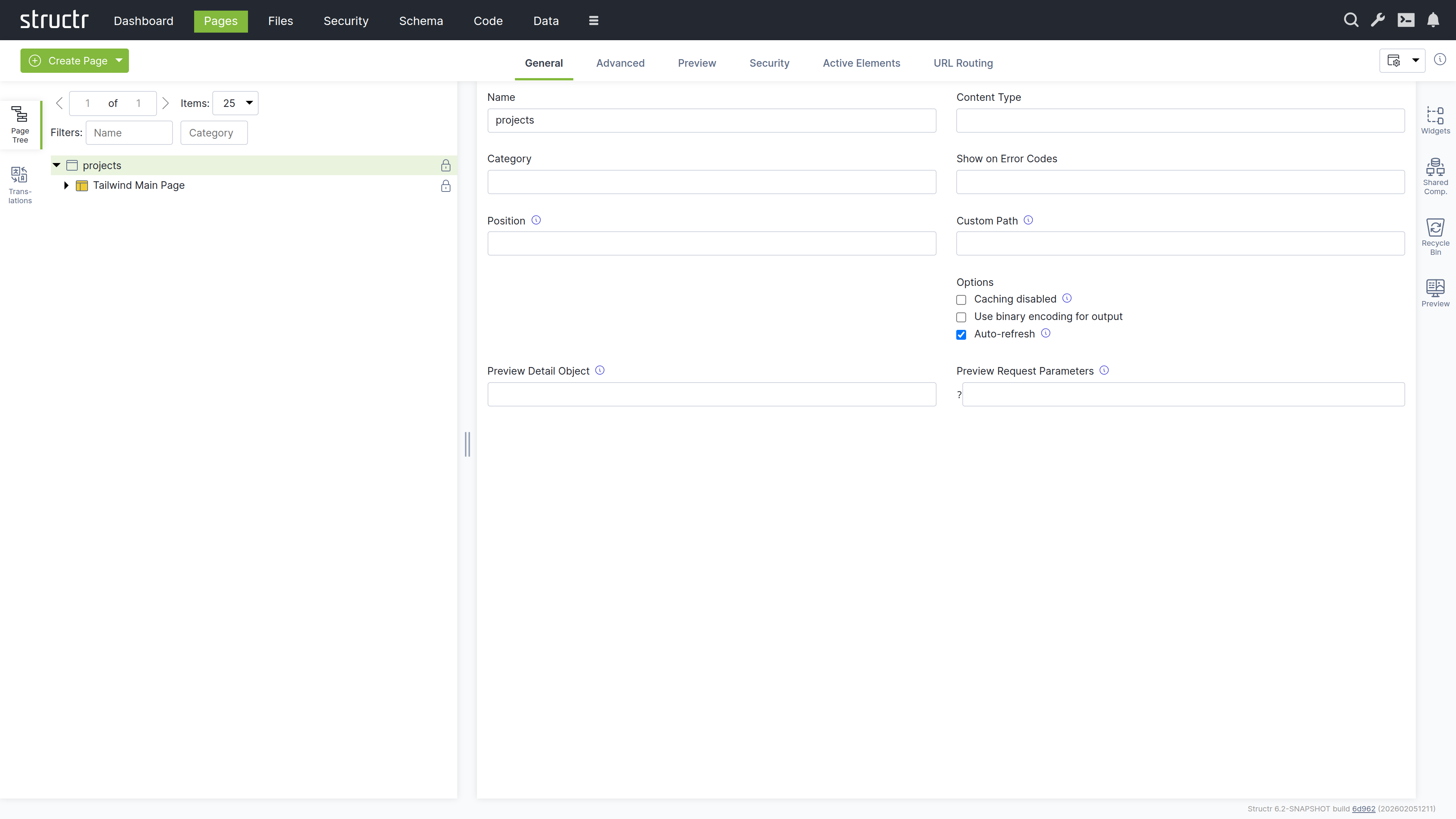
The Pages area is the visual editor for building your application’s user interface. It combines a page tree, property panels, and live preview in one workspace. Here you design layouts, configure data bindings, set up interactions, and preview the results.
The Workspace
The screen is divided into three parts: a left sidebar with the page tree and localization tools, a main area for properties and preview, and a right sidebar with widgets, shared components, recycle bin, and preview panel. All sidebars are collapsible, so you can expand your workspace when you need more room.
Left Sidebar
The Page Tree
The Pages panel shows all your pages as expandable trees. Each page reveals its structure when expanded: HTML elements, templates, content nodes, and their nesting relationships.
Element Icons
Different element types have distinct icons:
- Window icon – Page elements
- Box icon – HTML elements
- Colored box (red, green, yellow) – Repeater elements
- Application icon – Template elements
- Document icon – Content elements (these cannot be expanded because they have no children)
Visibility Indicators
A lock icon on the right of each element indicates its visibility settings:
- No icon – The element is visible to both public and authenticated users
- Lock with key – Only one visibility flag is enabled
Interaction
Click an element to select it and view its properties in the main area. Right-click (or hover and click the menu icon) to open the context menu. Drag elements to reorder them or move them between parents.
Localization
The Localization panel lets you manage translations for the current page. Select a page, enter a language code, and click refresh to see all localize() calls used in that page. You can create, edit, and delete translations directly here.
Right Sidebar
Widgets
The Widgets panel contains reusable page fragments. You can drag a widget onto your page tree to insert it. If the widget has configuration options, a dialog appears where you can enter values before insertion.
Suggested Widgets
Widgets can also appear as suggestions in the context menu when their selector matches the element you’ve right-clicked. This speeds up common patterns.
Local and Remote Widgets
The panel shows both local widgets (stored in your database) and remote widgets (fetched from configured servers). Click the plus button to create new local widgets.
Shared Components
Shared components work differently from widgets. When you insert a widget, Structr copies its content into your page. When you insert a shared component, Structr creates a reference to the original. If you edit the shared component, every page that uses it updates automatically.
You can create a shared component by dragging an element from the page tree into the Shared Components panel. Headers, footers, and navigation menus are ideal candidates – anything that should look and behave the same across multiple pages.
Recycle Bin
When you delete an element from a page, it goes to the recycle bin rather than being permanently removed. You can drag elements back into the page tree to restore them. This safety net is especially valuable when restructuring complex pages.
Note that pages themselves are not soft-deleted. When you delete a page, only its child elements go to the recycle bin.
Preview
The Preview panel shows your page as users will see it. You can keep the preview visible while working with other tabs in the main area, watching your changes take effect in real time.
Editing Elements
When you select an element in the page tree, the main area shows its properties organized in tabs. The available tabs depend on the element type.
General Tab
This contains basic settings: name, CSS classes, HTML ID, and inline styles. For repeaters, the Function Query and Data Key fields are located here. Show and Hide Conditions control whether the element appears in the output.
When a template element has a ComponentConfiguration (because its Widget source contained a config attribute), the General tab shows the component configuration dialog. This dialog lets you set up the DataSource, configure which fields are displayed and how they are rendered, control pagination and filtering, and set the component’s role in channel communication. For a detailed description of the dialog and all its settings, see the Widgets & Components chapter.
HTML Tab
This is available for HTML elements. Here you can manage HTML attributes – both global attributes and tag-specific ones. Click “Show all attributes” to reveal event handlers like onclick. You can add custom attributes with the plus button.
Editor Tab
This is available for templates and content elements. It provides a Monaco-based code editor with syntax highlighting and autocompletion. The content type selector at the bottom controls processing: Markdown and AsciiDoc convert to HTML, while plaintext, XML, and JSON output directly.
Repeater Tab
Here you can configure data-driven rendering. Select a source (Flow, Cypher Query, or Function Query), define the data key, and the element renders once for each object in the result.
Events Tab
Here you can set up Event Action Mappings – what happens when users interact with the element. Select a DOM event, choose an action, configure parameters, and define follow-up behaviors.
Security Tab
This shows access control settings: owner, visibility flags, and individual permissions.
Advanced Tab
This provides a raw view of all attributes in an editable table. It is useful for properties that are not exposed in other tabs.
Preview Tab
This shows the rendered page. Hover over elements to highlight them in both the preview and the tree. Click to select for editing.
Active Elements Tab
This gives you an overview of key components: templates, repeaters, and elements with event action mappings. Click any item to jump to its location in the tree.
URL Routing Tab
This is available for pages. Here you can configure additional URL paths with typed parameters. See the Navigation & Routing chapter for details.
The Context Menu
Right-click any element to open the context menu. What you see depends on the element type.
Insert Options
These let you add new elements as children or siblings. Suggested Widgets appear when widgets match the current element’s selector. Suggested Elements offer common children for the current tag (for example, <tr> for tables, <li> for lists).
Edit Options
- Clone – Copies the element and inserts it after the original
- Wrap Element In – Wraps the element with a new parent
- Replace Element With – Swaps the element while keeping its children
- Convert to Shared Component – Moves the element to shared components
Select/Deselect
This marks elements for move or clone operations. After selecting, you can right-click elsewhere and choose “Clone Selected Element Here” or “Move Selected Element Here.”
Remove Node
This sends the element to the recycle bin.
Creating Pages
The Create Page button in the secondary menu offers two options:
Create
Opens a dialog with templates based on Tailwind CSS, ranging from empty pages to complex layouts with sidebars and navigation. These templates are actually widgets with the “Is Page Template” flag enabled.
Import
Lets you create pages from HTML source code or by fetching from an external URL. This is how you bring existing designs into Structr and make them dynamic.
Related Topics
- Pages & Templates – Explains how to build page structures, work with templates, and create widgets and shared components
- Dynamic Content – Covers data binding, template expressions, and repeaters
- Event Action Mapping – Details how to handle user interactions
- Navigation & Routing – Describes URL configuration and the
currentkeyword - Security – Explains visibility flags and access control